Abbreviated version of article posted in LinkedIn: Nutrition, Nudges, and Sledge Hammers (registration is not required).
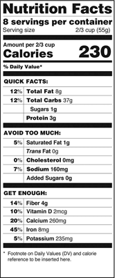
The US Food and Drug Administration (FDA) has proposed changing the labels now required on all foodstuff. The goal is to nudge people to better eating, "nudge" as in the subtle, clever, semi-conscious signals recommended by Rich Thaler and Cass Sunstein in their marvelous book by that name, "Nudge." But look at that huge number - it screams at the reader: that is not a subtle nudge, it is a NUDGE, no subtlety here. It is a sledge hammer.
The good part is that, the FDA has clearly thought about the legibility and clarity of nutritional guidelines. Not only did they decide to make the calorie count more visible, but they made the percentage values more prominent, they reconsidered what information was to be listed, and perhaps most important of all, they changed the definition of "a serving" to what people really eat.
.....
Although we could argue that the new, easier to read label is a blessing, design is an area of tradeoffs. Those big nutritional labels are both large and ugly. They take up much more space on the package, in some cases a large fraction of the area available, which means they end up with really tiny print, or they get covered by store labels and price tags. Moreover, the company has little room left for distinctive branding images and information. So the government is trading off health concerns against aesthetics and marketing concerns. Now we will see how the businesses react.
...
What is next? ... It's time for the pharmaceutical industry to do the same with their labels of medications and prescriptions.
When Consumers Reports ran tests at five chain pharmacies, all for the same prescription, they found "critical information that was confusing, misleading, buried, or absent." Most pharmacies didn't even follow FDA regulations.
Target introduced well-designed pill bottles into their pharmacies in 2005 (trademarked ClearRx), but as the Consumer Reports study showed, other pharmacies have not followed their lead. Too bad: the Target bottles are brilliant: easy to read, designed with the patient in mind, color coded, labels on the top of the bottle, and even room for a magnifier. The Industrial Design Society of America gave it a gold medal and called it the "Design of the Decade." Yet today, almost a decade later, prescription bottles are still incredibly badly - dangerously -- done.
...
The Institute of Medicine said that there were roughly 1.5 million preventable medication errors a year in the United States alone, with a third of those, one-half million, outside of hospitals. There is no excuse for this.
...
It's a systems problem. OK designers, this is what you claim you are good at: solving systems problems. Get to work: you could save lives. But first, a warning. If you want your results to be implemented, it will take more than a good idea, more than some nudges: it will require a sledge hammer.