Every so often I can't stop myself from complaining. This is one of those every so oftens.
I needed a headset to use while making video calls: the acoustics of my home had so many echoes that a headset and microphone was required. After much study and analysis, I purchased the LG Tone HBS-730 headset.
Ugh.
The good
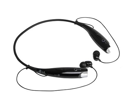
The headset is extremely cleverly designed. A simple ring that goes around the neck, with two earphones extruding on short wires. A magnet holds each earpiece in place for storage, making it easy to pull out the earpieces for usage and then to tuck them away for storage without danger of tangling the wires.
The sound quality is good: bluetooth pairing was never simpler.
The designers of the shape and form were excellent. The engineering design is excellent. So, why am I complaining?
The bad
I almost returned the product because I couldn't figure it out.
There is a necklace-like piece that goes around the neck with buttons along both sides. The labels on the buttons are either simple indentations in the black body or tiny gray letters on black. But there are two sides, and the identical looking buttons on the two sides do different things. Which side is left? No way of telling. Which button does which function? Really difficult to tell. And because there is no easy way to know which way the necklace goes on, even once someone has memorized what the left buttons do, the next time the item is worn, they are apt to be on the right.
The buttons cannot be seen when the device is worn around the neck, so the labels are only important in learning the device, not in usage. This means that you can only figure out which button you are using by its tactile feel. Hah: try feeling the differences among identical buttons.
The headset comes with an AC power supply and a USB cord. I couldn't even find the port on the neck;lace for the USB charger. The manuals didn't help. I had to hold my flashlight and go over ever part of the product until I found a black cap on the black surface that lifted up, revealing the usb port. On the left side. Or is it the right side. Will I ever find it again? (Yes, I will, because I ripped off the black covering cap so that the USB connector now has some tiny amount of visibility.)
(And while I was at it, I put a nice red sticky dot on the side that I decided would be the "right side" -- red for right -- near the on-off switch, so i could find it readily. Hmm, this defines the usb port to be on the right as well.)
The ugly
The Quick Start Guide was designed by a Graphic Designer. Very attractive black pages with tiny gray type. Very attractive, in what I have come to label as Art School Graphics. How can you make type attractive? Simple: make it invisible. If the product manager insists on having words, compromise by using very tiny font, at very low contrast so all that annoying text is as invisible as possible. For people of my advanced age, this meant that I had to shine a bright light on the text to have any hope of being able to read it, and even then I mostly failed.
A user manual was also provided, this one with black print on a white background. But now the font size was, oh, I don't know: 4 points? Nice high contrast, but such tiny lettering that it didn't matter. I know LG has had some financial difficulties, but surely they could have afforded slightly more paper, slightly more ink, and a legible font.
Signifiers
Affordances control what actions are possible. For designers, signifiers are far more important. Signifiers are how communication takes place, how one signals the appropriate controls and operations. The LG designers clearly missed the part of the course about the importance of communication in design. They need to learn about signifiers.
(I am tempted to say they should rush out and buy the latest edition of "Design of Everyday Things," available in Korean, but I won't.)
Conclusion.
No visibility. Insufficient tactile differentiation among the controls. No labeling of which side is right and which is left. This matters, both because these are stereo earphones and because the identical looking and feeling buttons do different things on the two sides of the device.
The manuals use incredibly tiny type small type in gray on a black background. Badly written as well, but we have come to take that as standard. Usually we can figure things out anyway by playing with the controls. Not these controls. They are invisible in use (deliberate), but with insufficient tactile distinction, with the left controls identical to the right one, but doing different things, and no way of knowing which is left and which right, so on each usage, they will vary randomly.
LG. get your act together.